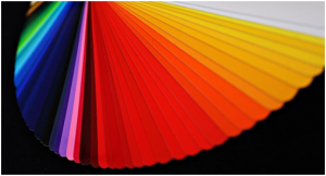
Much has been written and said about how we make intuitive connections with the elements that surround us, especially color. Through intuitive associations and through constant cultural stereotyping, colors now assume a greater role in industry and commerce. This is mainly because of the psychological effect of using color as a formidable branding tool. Companies have closely observed and studied how naturally colors can influence a consumer into thinking or feeling a certain way about the brand (and its products). Here, we attempt to share some of this information to help you create your brand identity, using colors.
Analyzing Colors
Before we begin to curate the colors of your brand identity, lets analyze the primary colors first, and then factor in your preferences. We must select the color based on:
The image of your brand that you intend to portray
The perceived likes of your target audience
The perceived dislikes of your target audience
Blue
They say blue only represents melancholia. But, branding experts know blue also represents reliability, trust, stability, and taste. PayPal, Citibank, and Skype would agree.
Green
Green represents nature, health, well-being, the environment and tranquility among other things. This makes it ideal for brands focused on natural care products – think Palmolive and Twining’s. Your partner promotional company can come up with excellent promotional products to help you claim the color green.
Yellow
Yellow has always been a fun color, avoiding all serious connotations that have plagued other colors. Yellow represents everything joyous about life. Yellow also represents enthusiasm and positivity. Is it any surprise, then, that McDonald’s, Nikon, Lays, and Sonic have adopted yellow as their brand’s identity?
Red
Love, passion, and danger – you know the color red means serious business. Brands understand the scope of using the color, and some of these brands have achieved great success in the process. YouTube, Coca-Cola, Netflix, and KFC are prime examples of the color red working as a strong brand identity, and they do complete justice with their offerings.
Orange
An instant hit amongst the youth, the reason for why orange retains its popularity is that it signifies positivity and vibrancy. There’s a reason why giants such as Nickelodeon, Fanta, Harley-Davidson, and JBL identify with orange.
Purple
Very few colors have the sophistication, richness, and royalty abundantly present in purple. If you want to display the power, seductiveness and instant appeal of your brand, choose purple. That’s precisely what Yahoo and Cadbury have done.
Putting it Together!
While selecting colors is an all-important step that determines much of your brand identity, it can all go wrong if you don’t put it together methodically. Here’s a three-point recipe to help you:
Text and Accents
Text and accents, along with the background of your logo, account for two of the primary elements. As a rule, it is preferred that you use a dark color to ensure maximum readability.
Background
The second primary element of your logo – the background – is the backdrop that is meant to highlight your text and accents. It goes without saying; if your text is dark the background must remain light in tone.
Play with Contrast
Contrast is a wonderful tool at your disposal when choosing colors for your brand identity. It’s always preferred that you use contrasting colors to highlight the most critical aspect of your logo. This contrast will add special life to your brand’s promotional merchandise such as custom t-shirts (leave it to a reputable promotional company).
There’s more to branding than the promotion of your products and services. Contact our experts to learn more about the scope of your branding and promotion. We are continually striving to provide the best promotional products in the market and maintain the highest level of customer service in the industry.

